I love content management systems. They make my life a developer so much easier without having to constantly update a site by hand for tiny little content changes. That being said, because of how powerful most CMSes are, they are often very difficult for back-end developers to work with and for front-end developers to style.
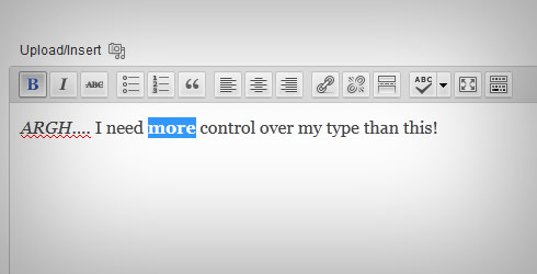
For a designer, one of the most annoying aspects of a site to style are the actual content that is created, often times by “What You See is What You Get” editors. These editors make posting content and changing text really easy for the client, but what if that client wants each line to be styled even a little bit different? It used to be the two options were talking a client out of it or hard coding that information in. This would happen a lot with smaller blocks that aren’t articles in shape, say listing a set of store hours for different locations.
Thankfully, we now have CSS3 to the rescue. There are some great new pseudo selectors like :first-of-type, :last-of-type, and :nth-of-type(n). The first two are self-explanatory as they select the first and last in a list of given element type. Let’s take an example:
<div class=”cms-content”>
<p>First</p>
<p>2</p>
<p>3</p>
<p>4</p>
<p>Last</p>
</div>
The paragraph (<p></p>) tags you see here are created when using a WYSWIG editor and the user hits the return key to make a new line. The “First” <p> tag from the WYSWIG would only be affected by :first of type. Similarly “Last” would be effected by :last-of-type. Now what about :nth-of-type(n)? This one is really cool as you can do this in your CSS:
.cms-content  p:nth-of-type(2){…}
.cms-content  p:nth-of-type(3) {…}
.cms-content  p:nth-of-type(4) {…}
You can even use and equation like p:nth-of-type(n-5), p:nth-of-type(2n-1), or whatever equation you can think of! This really help with WYSWIG because you can tell the client what to put on each line and each one will get styled as they wanted! Awesome! Just remember this only works for CSS3 so this is best used for mobile only sites/styles.
Now say you want to do this as browser compliant as possible (down to IE7 let’s say). The alternative is to use the sibling selector. This one can be a bit trickier to work with. Using the same example HTML from above, here is what the CSS would look like:
.cms-content  p{…}
.cms-content  p + p{…}
.cms-content  p + p + p{…}
.cms-content  p + p + p + p{…}
Now the major down side with this is the first <p> tag can only be selected by the basic element selector (which also, of course, tags all the other paragraph tags). This becomes a problem if any of the siblings have drastically different styles than the first <p> element. However this can get this done almost as easily as :nth-of-type(n).
There’s all sort of options you can do with this that break out of the limitations of the WYSIWYG editor. You can change text size, or transform it to uppercase.With the tags these generate you can have different styles for different words in each <p> tag, but they don’t have to be what they look like in the WYSIWYG editor.
Questions or comments? Share them below, or tweet us @Pixafy!
Related articles:


