

As responsive design comes increasingly into prominence, with more clients looking to make their sites more elastic to handle the diversity of screen resolutions currently, it’s very tempting to step away from more time-honored practices and let the browser do more of the work. A great example of this is image sizing.
The early web days was, in general, something of preciseness – use photo editing software to resize the image to the precise dimensions you’ll need, use the proper compression techniques for the type of graphic it is, and wringing as much performance as was feasible without sacrificing (much) quality. Of course, in the days of dial-up modems and images that took forrrrrevvvver to load, it made sense.
Nowadays, for many of us, we’ve gotten spoiled. My internet connection here at Pixafy, by comparison to that era, is absolutely ridiculous, while the one I have at home is merely ridiculous. Monitor resolutions have increased dramatically, and the quality of screens have evolved to make browsing the web even more exciting.
But those pesky rules established 15 years ago are still important for a few reasons, not unlike the challenges developers face in terms of browser compatibility. There are two major negatives against using auto-scaling to make a photo bigger or smaller within the web browser, as opposed to being more rigid and using Photoshop.
The first is pretty basic: The normal intent is to make an image big, and then shrink it to fit the various screens. It’s really tempting to take a picture that would fill a screen for a 27” iMac – 2500 pixels wide or so – and shrink it down for various browsers so everyone can see a quality image. The challenge, of course, is that the image is then pretty hefty – usually a few megabytes, assuming enough color diversity and a big enough picture (solid colors or more basic imagery, of course, would be less).
Pulling that site up on a mobile device, even using WiFi, can lead to a performance hit as the device has to use more memory to load the page, and has to process it more intensely. The bandwidth downloading the site also increases dramatically, which can be challenging for a good chunk of people still on slower 3G networks or overworked towers in busier areas. For a few clients, we’ve asked if we need to really start at the top, or if there’s a middle ground that scaling up to a certain point may be acceptable enough.
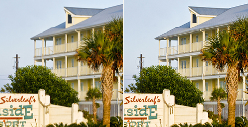
On the left, a picture mis-sized by 2 pixels in a browser. On the right, a properly-sized image. Look to the tree for an example of the loss of detail on the left side vs. the right.
The second side of it is the browser doesn’t do all that good a job of resizing images, in part because a pixel is basically a pixel; if it has to render 500 pixels of data in a 400-pixel space, it has to effectively interpolate the image based on the data it has, and the result generally results in a blurry picture (with some clean math points, such as the 50% point, looking generally OK because the math and render is easier to decipher). Once a picture is being resized by the browser instead of you, you also lose some control, as it’s completely up to the OS, machine and browser combo how that ends up looking. Some combinations will inevitably work better than others, just like other browser-specific items like web fonts.

In this example, the type is rendered in a much more blurry way in the example at left, which is shrunk by 2 pixels in the browser, vs. the one on the right.
In a weird way, the rules established 15 years ago therefore still matter, because there’s a key decision to be made. Some will make things slower, but sharper. Some will make it faster, but a bit blurrier. Sometimes it was worth the wait for those images to render because, when done, it was quite amazing for that time. Other times (and I’d say a majority of the time), getting a site’s performance up to snuff was the critical decider, and Photoshop was ultimately broken out to drive down the image sizing and increase page loading speeds. Design choices would minimize colors within images or graphics to minimize file sizes.
As such, optimization of a site, based on a client’s goals, remains job one. Abandoning some of the older rules is fine, as long as you know what you’re getting yourself into. It’s important to weigh these decisions with your client, to ensure they understand why an image might appear a bit more blurry, or why a given page is going to take awhile to load. Helping them, and your own team, understand the trade-offs, will likely result in a solution more acceptable to all parties.
Questions or comments? Share them below, or tweet us @Pixafy!
[series_block]
This post is part of a series on Responsive Design tips:
- 5 useful CSS tips for responsive design
- 5 tips to help you prepare for your responsive design site
- The subtler side of responsive design
- Resizing images in a browser: Proceed with caution (current)
- Exploring performance issues on mobile devices
[/series_block]