The term “Responsive Web Design” has become quite the buzzword in design circles as of late, a tacit recognition of the increasing popularity of mobile devices overall for web browsing. Just as, during my time in the newspaper industry, the mantra “Digital First!” became the catch phrase, increasingly the chant is “Mobile first!” among designers.
The mobile divide
Mobile growth numbers are much more site dependent than some of the browser trends we’ve seen over the years; indeed, this reminds me of how tech sites saw a spike in Firefox long before mainstream sites did; the adoption rate for those sites made sense, as technology-forward people were all over it.
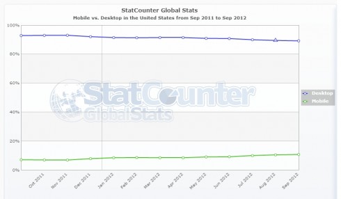
For the mobile space, I’m seeing the transition much faster on content-rich sites, particularly those in the news/blogging business. It makes sense, given that content is shared so freely on social media. Meanwhile, the overall trend isn’t nearly so drastic, as this StatCounter Global Stats graph shows:

Graphic courtesy StatCounter Global Stats. Click graphic to enlarge.
What’s surprised me is in the process and enthusiasm of thinking smaller, most sites are not using the same techniques to think bigger. And few are doing it really well.
More diversity of screen sizes…
When I first got started in the late 90s, monitor sizes were much more predictable. Most websites were designed with the assumption that most people had a screen resolution of 800×600, so your page widths never exceeded what could fit in that resolution. Eventually, the tide shifted to the 960-pixel width, which is still true today. That standard matched the shift to larger tube monitors, which weren’t getting much bigger because a 19” screen was basically the size of a desk (it certainly felt that way).
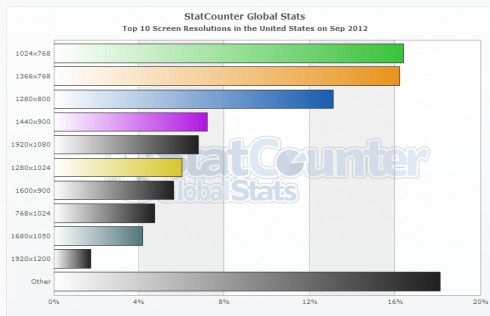
With the proliferation of flat-panel monitors came more screen sizes and resolutions. Initially, they mimicked in size and resolution their tube counterparts, but quickly widescreen monitors of all sorts of sizes began to appear, along with a growing number of screen sizes in the laptop realm as well, many with different resolutions. This has led to a wider set of screen resolutions, ranging from the now-classic 1024×768 adopted by the iPad to the HD-resolution of 1920×1080, and even beyond that on huge screens such as the 27” iMac. Indeed, this StatCounter graph shows 1024 is still the most common pixel width, but in aggregate more than half of people have a width that extends beyond it:

Graphic courtesy StatCounter Global Stats. Click graphic to enlarge.
The only real change we’ve seen on most sites that break out of the grid is an ad unit that fills the background. That may help from a revenue perspective, but from a user perspective it doesn’t mean much other than a frustration when you accidentally click one of those giant background spaces.

An ad background takes over the empty space on the Onion’s A.V. Club page. Click image to enlarge.
…More diversity of white space
Let’s return to responsive web design. In this world of screen diversity, where does that leave us? Generally, the transition from mobile, to tablet (read: iPad, at least for now), to desktop starts out strong…

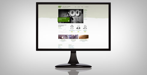
The Do Lectures site in, from left, mobile, tablet and standard desktop widths. Click image to enlarge.
But once you pass the standard 960 pixels or so, it becomes a lot more frustrating. Here’s the same site as seen on a 27” iMac:

The same website as seen full screen on a 27″ iMac. Click image to enlarge.
The argument could easily be made that it’s hard to design for screens three times the size of the smallest ones, going from small desktop screens to the 27” iMac… but that’s exactly the problem we’re solving for mobile, isn’t it? Going from a 320-pixel width to a 960 is exactly triple, in fact. It does, however, require a lot of thought to effectively cover the entire spectrum.
Understandably, mobile’s a concern because rendering big sites on a small screen can break functionality or layouts, or in the absence of problems just be annoying. That doesn’t make a tiny page on a huge screen any less annoying, though, and it doesn’t have to be this way.
Responsive design, take 2
I love the possibilities responsive layouts can provide to help resolve the issue of screen diversity. The same techniques that allow us to lay the pages out differently based on smaller screen sizes can be employed on bigger ones. This can effectively be employed in a number of ways.
Some sites that are responsive down to mobile to take pains to at least attempt to factor in larger browsers. In some cases it can be as subtle as the smart use of background images, or using photo positioning to even things out a bit:

The El Sendero del Cacao website uses widescreen imagery well to fill the screen. Click image to enlarge.
Here at Pixafy, we’ve begun to employ similar subtle tricks on some of our latest launches. Both Sugarpova and L’Etoile Sport, for instance, used subtle responsive design techniques on their homepages. For client Tasting Table, we have had a lot of fun with responsive templates, but focusing solely in the mobile space (their mobile site diverts to separate templates).

Sugarpova uses a more subtle version of responsive design to expand the slider larger for bigger screens, which adds to the visual impact. Click image to enlarge.
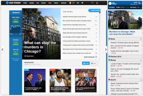
More creative uses of these techniques are leading to more functional sites. Take USA Today’s redesigned site, which recently launched. The site, which was clearly designed with tablets also in mind, adds another column of news for wider browsers, making great use of the extra real estate to present additional content.

USA Today adds a column of additional news that responds to the width of the browser. Click image to enlarge.
USA Today’s redesign also skipped the responsive mobile template, opting for a separate mobile theme, showing that responsive down to mobile isn’t for everyone.

USA Today uses a separate mobile template, bucking the responsive design trend. Click image to enlarge.
While browser detection tricks aren’t perfect, serving much smaller files for a subset of users on lower-bandwidth and lower-horsepower devices does have allure, and offers the USA Today team the ability to focus on tablet and desktop, to powerful results.
It’s important to look ahead and ensure that you’re not missing a potential trends that could leave you out in the cold, but I also think it’s important not to over engineer for a smaller audience when a bigger one could also be served in a more effective way. This means, more than ever, looking at your audience (or, for new sites, knowing your target audience) will be the most informative of all.
Those with more mobile-based audiences should certainly be thinking about it, and even acting on it in cases where revenue’s at stake, but in the meantime most of us still have a large percentage looking at our sites on ever-growing screens, and we should consider that side of the spectrum as well. Somewhere along the line, 960 became a solemn number, and it’s time to break free of that.
Do you use techniques to improve the experience for those on larger screens? Share with us in the comments!
[series_block]
Related posts on Responsive Design:


