
We recently delved into typography and the differences between traditional and web typography in part 1 of the “Translating typography for the web” series. We explored points that can help improve type quality and save you time when working with web typography. Today, we bring you the second installation of key points to note when translating typography from print to screen:
[series_block]
This post is part of a series on “Translating typography for the web”:
[/series_block]
A Matter of Scale
As with most aspects relating to type, differences between print and screen mediums become critical with more extreme scales, whether very large or small. Jagged edges, uneven letters, and inner spacing are just a few items to be cautious of, to name a few. So, how do we deal with these issues?
A broad consensus dictates that blocks of text should be somewhere between 12 to 16 px to increase readability, which is critical. However, one font may look bigger or smaller in comparison to another font of the same size, making this rule more of a reference point. The perceived difference between font-families of the same size is usually caused by their different x-heights, which is crucial for readability. X-height is the distance between the baseline and the mean line, or usually the height of the letter x (hence the name). More on type anatomy here: http://www.typographydeconstructed.com/category/anatomy-of-type/
In general, higher x-heights provide better readability on the screen, a very desirable feature. Of course, that is not the only factor, but it is a good place to start. In this instance, size matters and choosing the right font helps greatly. The right font choice sometimes means selecting high-quality fonts that were produced carefully, which may come with a price tag.
The combination of the right font, proper scale and line-height are deciding factors on how readable your text will be. Recommended line-height is around 150%, but once more, particular aspects of the fonts may force you to adapt. The following tool has limited choices, but it may be very handy when choosing fonts for text-blocks: http://www.typetester.org/
Aspects that affect type rendering
Besides size, many aspects could influence type rendering and its readability on the web. One important aspect is color. Contrast between type color and background color has to be in a comfortable range: too much or too little contrast can result in stress for the eyes. Higher contrasts tend to show more of jagged edges and any imperfections the font may have. Optical vibration caused by complementary and bright colors should also be avoided in favor of readability.
Source: http://www.everydayworks.com/?p=318
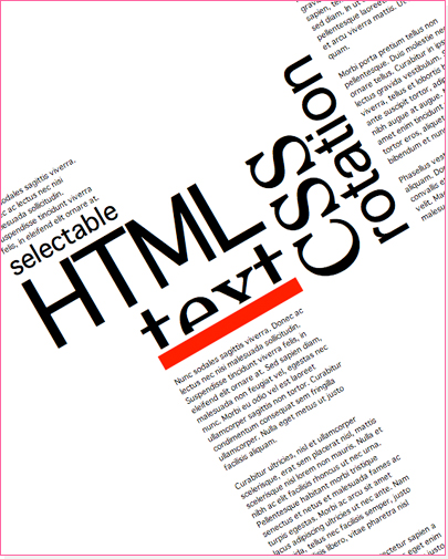
Rotation of type may cause undesirable results and should be carefully tested. CSS declarations of font-smoothing that try to deal with anti-aliasing and text-rendering are starting to be supported by some modern browsers but results are still inconsistent. In any case, they may be interesting objects for investigation. For more information on text-rendering, check: http://aestheticallyloyal.com/public/optimize-legibility/ and https://developer.mozilla.org/en-US/docs/CSS/text-rendering.
Ems
From print to screen, it may be easier to think in pixels, which is totally fine. EMs work in a relative manner and become extremely relevant when dealing with scalable and flexible designs. It is important to keep in mind that it will look for a parent element value for reference; if no value is set, it will comply to browser preferences, which by default is 16px, but may be altered by the user. EMs can be used not only for text but for line-height, padding and many other measurements — a very powerful tool indeed! For quick conversion and reference, check out the followin: http://pxtoem.com/
A Step Further into the Golden Typography Path
Dashes, Quotes, Apostrophes
One of the small changes that can go very far in the path to Golden Typography is using the correct symbols instead of the default ones. A good example could be the default apostrophe (or single quote) that is part of our keyboards: the default apostrophe does not have any “angle” and is not the right choice for opening and closing single quotes. The ideal typographic choice would be left single curly quote and right single curly quote, which are achieved by using Character Entities. There are two possible formats: name (‘ ’) or number (‘ ’ ). Of course after a while, it is easy to remember the first format, at least for the most used symbols. To get it started, or for reference to those symbols that you cannot remember, this table is a great reference: http://www.w3schools.com/tags/ref_symbols.asp.
Source: http://florinf.wordpress.com/
Crossing the borders of language and making readers happy
Following the same idea, sooner or later, every developer has to deal with text in foreign languages. With that task comes the challenge of properly handling accents and different characters. Keep in mind that “música” written as “musica” is not only missing an embellishment, but it is simply misspelled. In order to keep moving towards our Typography Golden Goal, the approach is the same as used for symbols: using the correct HTML entities will render proper grammar and happy readers (even your Spanish teacher).
Using a reference table such as http://www.w3schools.com/tags/ref_entities.asp will help you greatly. Watch for web fonts support to different languages, as many of them do not have accented characters or lack many of them. Services such as Typekit allow filtering of the type collections by their language support, which is a big help.
Near future and beyond…
Typography control on the web is improving. CSS3 is full of promises that can only be fulfilled by compliant browsers. Although many of the coveted features are not fully supported, the future of styling type for the web is a bright one and may arrive soon. Meanwhile, testing thoroughly is very important, but always keep an eye out for fresh and new possibilities!
Did you find this series on “Translating typography for the web” useful? What are some additional tips you have for working with type on the web? Please share your comments and questions below, or tweet us @Pixafy!